Tips for Choosing the Right Marble Vein for Your Style
17/03/2022
Caesarstone
Caesarstone


Richly veined white marble has never gone out of fashion – its classic good looks look equally at home in contemporary interiors as well as traditional designs. And, with more marble being seen in kitchens and bathrooms in recent years, it seems only fair that Calacatta-style surfaces are returning to the top of the popularity stakes.
The challenge is how to choose the right marble to suit your style. Do you go for subtle veining for a minimalist space, or are you looking for a show-stopping feature for your kitchen?
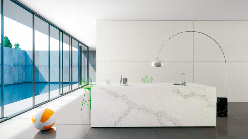
Caesarstone® has an enviable array of marble-style surfaces to choose from – ranging from smaller, subdued veined styles to the more dramatic Calacatta-look marbles.
These start with the subtle Frosty Carrina and Calacatta Nuvo, through to the more prominent Statuario Maximus and White Attica – and now to the latest release, the spectacular Empira White.
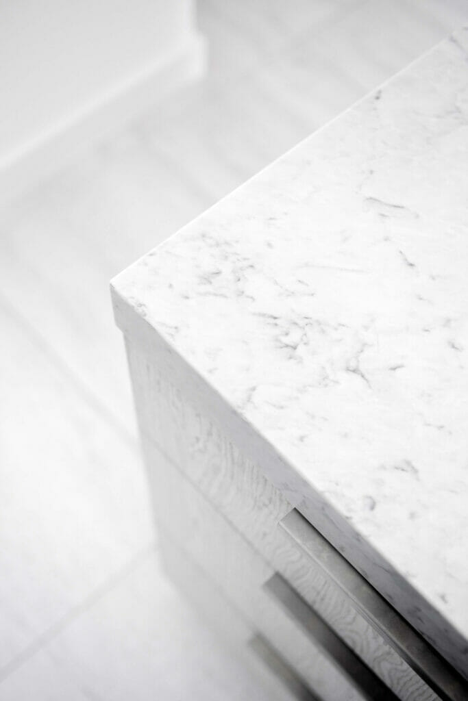
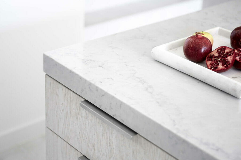
Designed to be Caesarstone’s ‘whitest white’ of the Supernatural veins, Empira White is a unique marble quartz, its classical white base coloured in the purest of hues. This beautiful, high-end surface is a backdrop to the more dominant, almost black veins that traverse the countertop, creating a contrast between darkness and light. It offers a refined rustle of fine lines atop shadowy alluvial layers that add depth.
As Caesarstone’s latest interpretation of Calacatta marble, Empira White elevates any interior – offering the sophisticated beauty of natural stone with the durability and easy maintenance for which Caesarstone® is renowned.
Designer Dominique Brammah says she tends to specify Caesarstone® when it needs to be a serviceable surface.
“I have found so many people are drawn to the Caesarstone® veins just because they’re so much more robust than natural stone,” she explains. She says the key to choosing the right style is to consider the size of the final application. “I find Carrara styles are useful for smaller kitchens because the scale of the grain is a lot smaller, so you’re getting these smaller scale patterns, which I think is really fantastic on small surfaces.”
“I would use the larger scale veining that you get on a Calacatta marble on a big surface like an island bench or a really big splashback that then makes the stone the feature.”
“Colours such as Statuario Maximus and Calacatta Nuvo have those big vein patterns across the flat. I would want to use as much of the flat as possible and make it a feature.”
“I tend to use those big vein stones in a large area – a big kitchen, with a splashback and bench. The main difference between the Statuario Maximus and the Calacatta Nuvo is that the Statuario Maximus is really strong with a grey veining, which would tend to suit more contemporary style kitchens, whereas the Calacatta Nuvo has that softer grain base. I’d want to warm that up with some timber. I’d be using Calacatta Nuvo in a kitchen that’s got a bit more detail rather than a large white expanse of a kitchen.”
Dominique Brammah
Interior designer Stewart Horton of Horton & Co often starts with the base colour palette of the interior when choosing a white marble – he says would choose a Calacatta style if he wanted to keep it crisp, with cool tones such as greys and whites, in very contemporary homes.
“But if you have a home with a lot of timber in it you might want to mix it up,” he adds. “I think houses, where there’s a lot of timber, do lend themselves to having a touch of ivory, a touch of a beige in it, just so it holistically kind of works.”
The look of marble has always been timeless, and Horton says, that its classical beauty has given the material many uses, making it work in many different interior schemes.
“The thing is, it’s so versatile,” he says. “It’ll work for Hamptons, but then, you know, you can use it in a contemporary interior, and it’ll still work there as well.”
“It’s all a balance. So if you’ve got something that’s got a very strong veining, then you might keep everything else a little bit subdued, but it depends on the scheme. In some homes, you want everything muted and pared down. The next client might want something a bit more dramatic, so then that’s when something with a lot of deep veins would, I think, work well. In my own place, I used a crisp white with very dark grey veins. My house is very pared back with the palette, but I wanted that really deep veining as a dramatic kind of contrast.”
“It’s all a balance. So if you’ve got something that’s got a very strong veining, then you might keep everything else a little bit subdued, but it depends on the scheme. In some homes, you want everything muted and pared down. The next client might want something a bit more dramatic, so then that’s when something with a lot of deep veins would, I think, work well.”
Stewart Horton, Horton & Co
“In my own place, I used a crisp white with very dark grey veins. My house is very pared back with the palette, but I wanted that really deep veining as a really dramatic kind of contrast.”
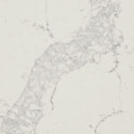
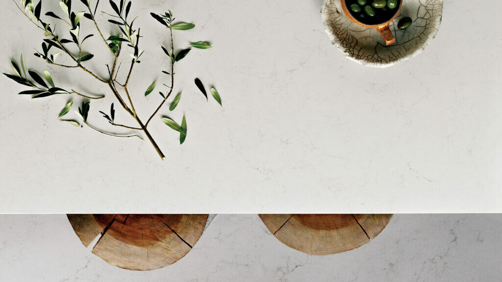
Frosty Carrina – This surface has a beautiful soft ivory/white base with delicate powdery grey veins. The smaller veins make it ideal for petite kitchens, bathrooms or laundries. Its subtlety also works well when paired with a dramatic feature such as a brightly coloured tiled splashback or freestanding stove.
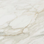
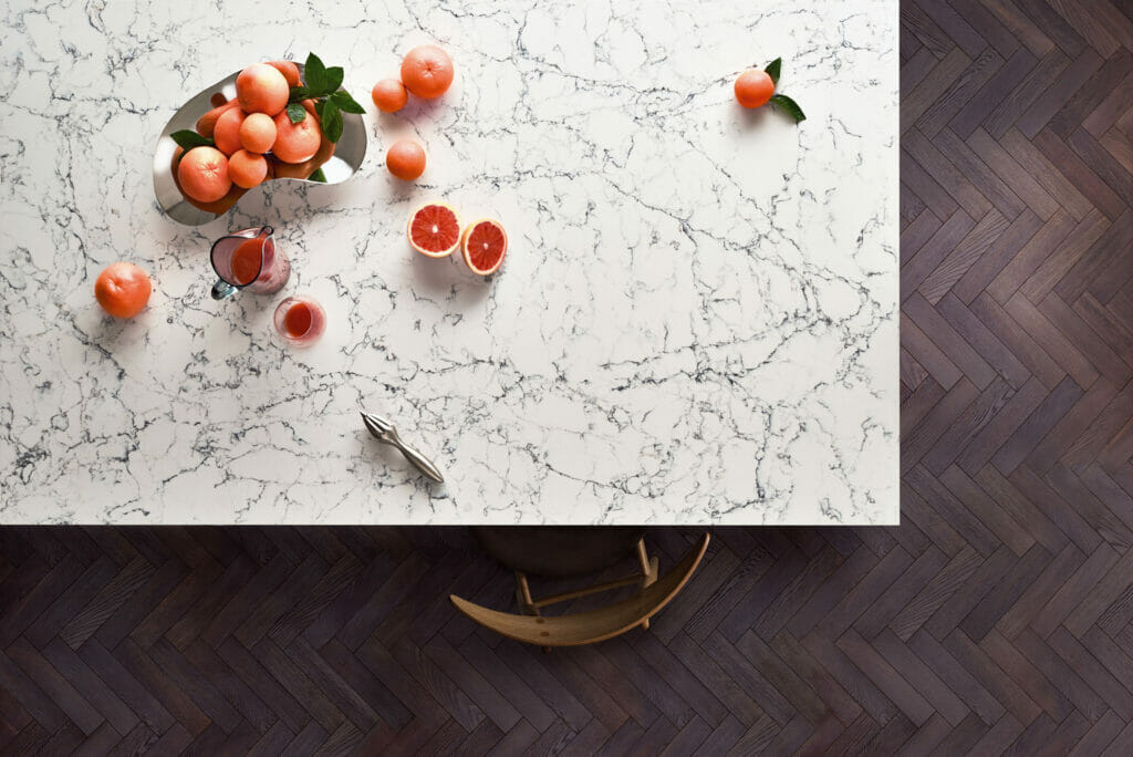
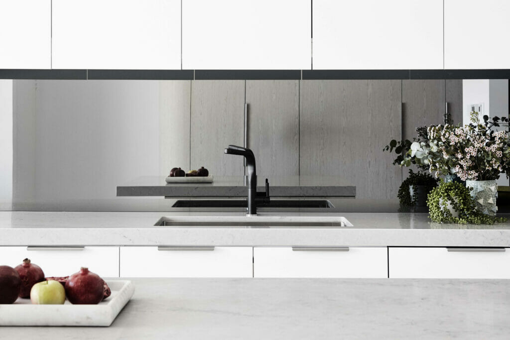
Calacatta Nuvo – Caesarstone’s interpretation of natural Calacatta marble, Calacatta Nuvo™ brings you wide, elegant, cascading, grey veins on a white base Perfect for larger surface areas such as an island bench, or a generous splashback. It’s ideally suited to rich dark cabinets in navy or charcoal..
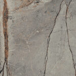
Statuario Maximus – This large-scale vein design has a warmer undertone, with dark, dramatic veining that best suits mitred aprons if being used on island benches. Match with natural timbers or even a soft terrazzo-style surface..
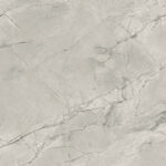
White Attica – Inspired by classic natural marbles, White Attica features a clean white base with dense, dark grey interwoven veins. This intricate surface works well with crisp white gloss handless cabinetry that will allow its detailing to make a strong statement..
NEW Empira White – The whitest white of the Caesarstone® range, this exciting new colour complements the modern trend of brass accessories and light fixtures. Other complementary materials include dark stained wooden floors, white or taupe cabinets, and walls painted in subtle tones of off-white or grey.
Looking for a moody grey with beautiful marble inspired veins!
Noble Grey – Luxurious broad dark grey natural veins sweep across a gentle light grey background.
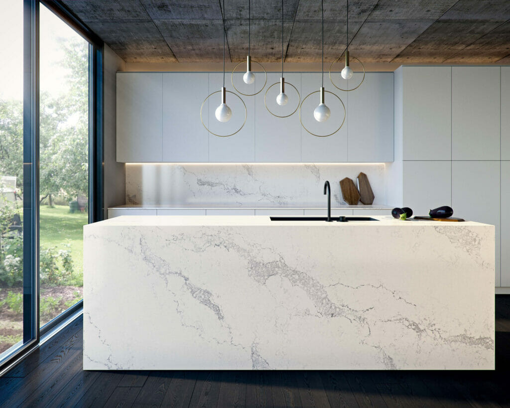
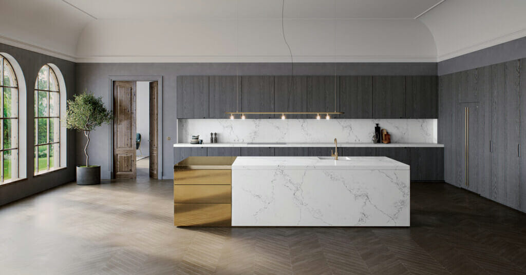
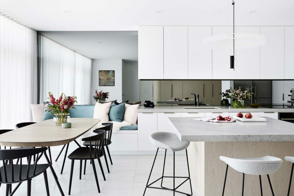
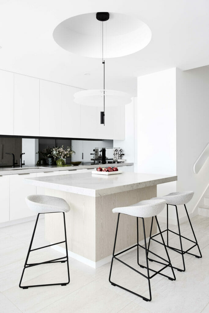
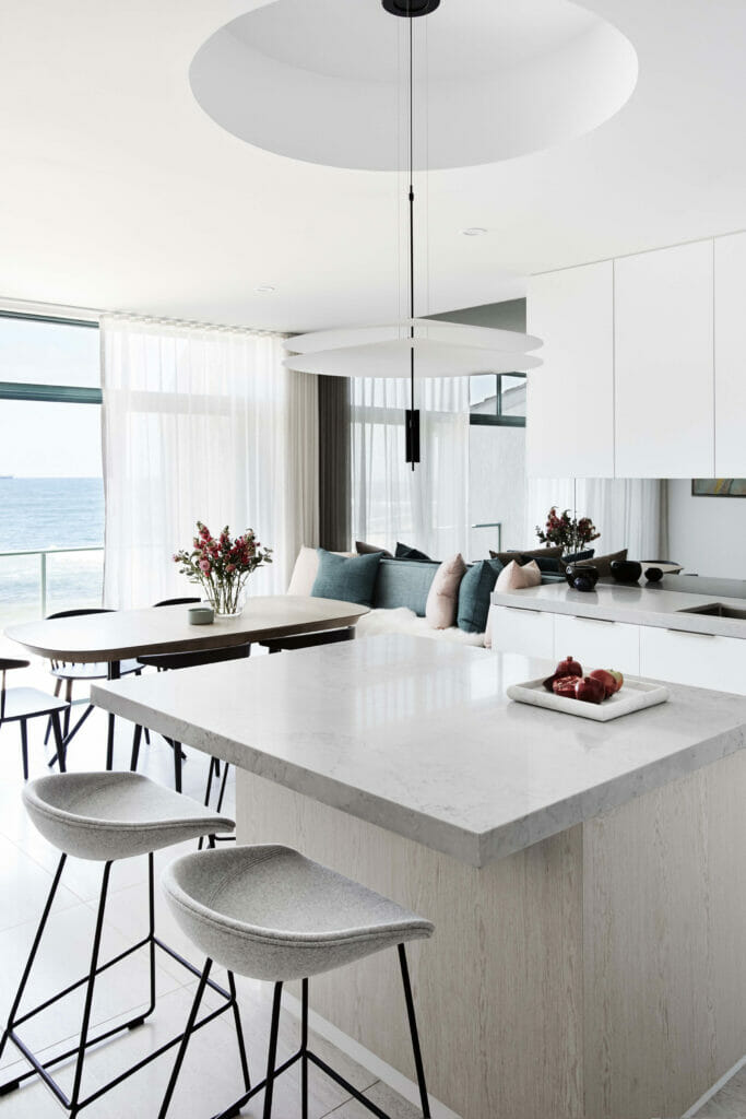
Get inspired with this beautiful kitchen space by Interior designer Stewart Horton of Horton & Co.
https://www.hortonandco.com.au/
http://www.dominiquebrammah.com/
{{ subtitle }}
{{ subtitle }}
{{ subtitle }}
{{ i.desc }}
{{ subtitle }}
{{ subtitle }}
No worries! We will send you an email to reset your password
If '{{this.email}}' email address exists, we have sent an email with password reset instructions.
Please note: If the email does not show up within one hour, check your spam folder or try to reset your password again after one hour.